Search engine optimization practices are constantly evolving, and it’s important to keep pace with best practices to improve law firm SEO in 2024 and beyond. Otherwise, you risk poor...
July 23, 2024
Insight
What part of a website page gets the most attention? Tips you should know.
September 26, 2013
Last week, Adweek highlighted some research conducted by Chartbeat on visitor engagement when viewing a webpage. Useful information when you are planning or redesigning your website.
While the Adweek article is focused on the impact this research could have to online advertisement purchasing and placement the results are also very interesting when thinking about where to place content on a page to gain the most traction with an end user.
You had me just below the fold!
Being the curious folks they are, Chartbeat analysed a random sample of 25 million user sessions to see what was going on. Some of their results are counter-intuitive. Back in the old days (2006?) designers strived to always keep key information above the fold. In fact some sites were so short they didn’t have a fold, at least on their homepages. This trend is changing but not everyone has gotten the message. Some clients still think that it is imperative to get key information as far up the page a possible. They still live by the notion that the most important things they want their customers to see should be the first thing they see, but as the research shows this is flawed logic. It’s is possibly the worst thing you could be doing with critical information if you want clients to engage with your website.
As a point of order… you are now at the sweet spot of this page and as such I now will list out the key points I want you to take away. See how it works?
For all you Marketers and Designers reading this, below are the top 8 things they discovered about a website visitors behavior and the impact it had on what part of the page they actually saw (a typical fold on a desktop is about 700 pixels):
- 66% of visitors typically engage with a page they visit and spend an average 47 seconds doing so.
- The top 200 pixels are seen by 70% of visitors but only for about 4 secs before they start to scroll.
- A typical carousel, or a big photography banner at the top of a page will be seen for about 6 seconds.
- Content just below the fold maximized the exposure time that content has with a visitor.
- Just above the fold increased the frequency of exposure but did not necessarily prolong that visitors engagement with the content.
- 600 – 1000 pixels will hedge-your-bets as these are seen by 80% of visitors for an average of 13 secs.
- Once a visitor gets below the 550 pixels mark there is a 50% likelihood they will scroll to see the 1000 pixel mark.
- The 1200 pixel mark is the peak viewing point for most users gaining nearly 18 seconds of viewing time, assuming they haven’t bounced from the page by then. If they haven’t they are probably very engaged in what you have to say.
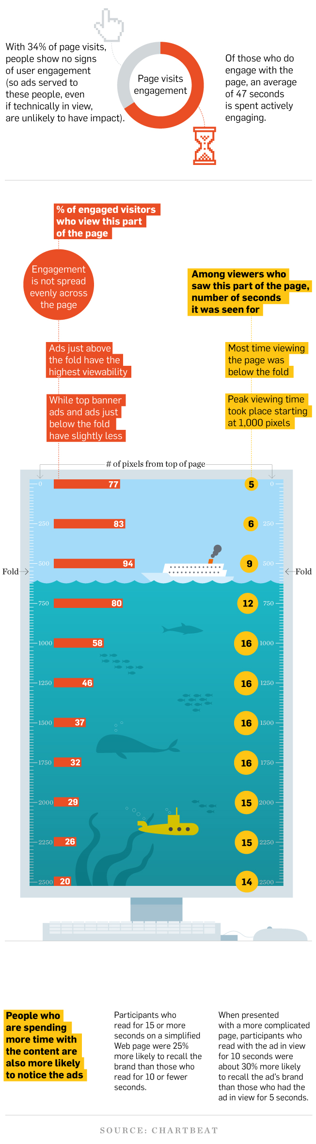
In case you like your information visually here is the Adweek Infographic which gives a great overview of the raw data.
Infographic: Carlos Monteiro
In looking at our own Google Analytics data for our website we found that at least on the homepage the data correlated with the research and we see the most engagement (click thru’s) on pages with links that appear near or below the fold. We saw additional heightened engagement (time spent on page) increase on pages where the primary content is also in and around or below the fold.
So, while first impressions (top of page) are important that impression is very fleeting. If you are in the throws of building our your site or re-thinking your approach it might be a good idea to pause and look at how you are presenting content to your clients.
Top three rules when structuring content on a webpage.
- You should aim to draw your audience in by building up content gradually as they move down the page.
- Try and build to a crescendo that starts just above the fold and hit them were it hurts somewhere just under it.
- If you can maintain their attention beyond this point then you probably have achieved your goals with a page as they will most likely continue reading.
However this research only really applies to desktop browsers. It gets more complicated when trying to design for smartphones and tablets, which apart from being in various sizes complicate things by having two folds (landscape and portrait) depending on how you hold the device. Hence why adaptive design is such a hot topic these days, but that’s for another day.
What do you think of Chartbeats research? Do you see similar activity on your site? Tell us your experience. The comments section is waiting below.

Related Insights
See All Insights