In summer 2023, the world had high hopes for Meta’s newest social media platform, Threads. At a time when it looked like Elon Musk’s overnight rebrand from Twitter to X would contribute to the...
June 25, 2024
7 Elements That Make a Good Law Firm Logo
Having a good law firm logo is the cornerstone of having an effective brand. More than just an image, your logo lays the foundation of your firm’s brand identity.
Your logo is a powerful symbol that differentiates you from the competition and creates a point of reference for clients. In this post, we’ll explore the elements that make for a great law firm logo and share a few of our favourite examples.
1. Colour Palette
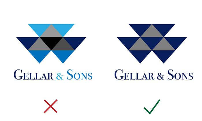
An effective colour palette for a logo is simple and employs limited colours. The average logo has a maximum of three colours. Make sure that your logo uses saturated colours and not pastels—this will ensure that your logo is easily read. If you have a colour palette for your law firm then it’s best to use your two or three main colours in your logo.
2. Silhouette
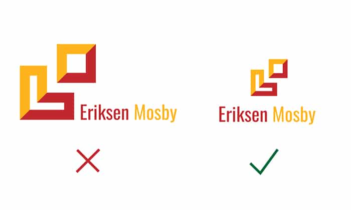
A great logo has a distinctive and balanced silhouette. Make sure your logo is not too long and narrow and not too squat and square. A good way to visualize this principle is to think about how your logo would look as a stamp.
Your logo should also be easily convertible into other formats such as black and white or one colour for use in other branded items like clothing or pens. Not to mention big billboards or newspaper ads.
3. Simplicity
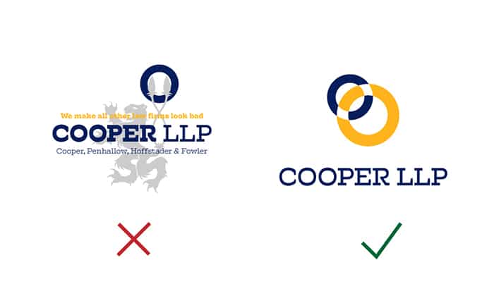
Arguably the most important element to a good logo in any business is simplicity. As Albert Einstein said, “Genius is making complex ideas simple, not making simple ideas complex”. Make sure that your logo doesn’t have too many elements such as your full name, your slogan or anything else that is not necessary for everyday use.
Effective logos are also simple in the sense that they are not overly illustrated and don’t have a ton of details that could be lost at smaller sizes. Your logo should be clean and easy to recognize even when it’s tiny at the bottom right-hand corner of a presentation.
4. Timelessness
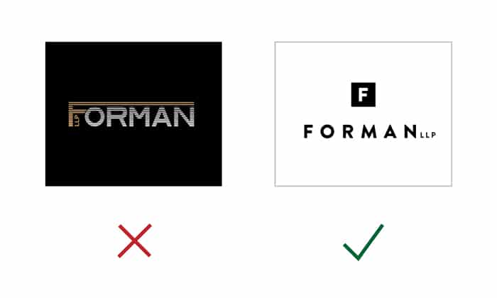
This one is tough because it’s so easy to fall into design trends. Certain graphical elements become fashionable and it’s easy to think they will stick around forever. But it’s also easy to spot a logo from a different era when the priority for the designer was to follow the current trends. A good logo is timeless. It makes use of classical design principles and isn’t too influenced by the design aesthetics of the time.
5. Uniqueness

A unique logo is essential but you cannot have a logo so different from your competitors that it is impossible to tell what your business is about. It’s important to look at what your competition is doing and create a logo that is easily recognizable as a law firm logo but not copying any other brand.
6. Typography
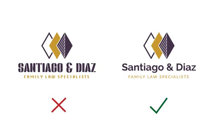
Typography tells the story of your brand. If you want your family law firm to have open, friendly and warm connotations then the typography that you use will be very different from that of a tough litigation firm. Every detail affects the message that your brand is sending to your audience so think carefully about what message you wish to send.
7. Abstraction

Avoid cliche elements that label your firm as a law firm such as a gavel or the scales of justice. Being too literal is a rookie mistake for a lot of novice designers, so don’t fall into this trap as it can easily mark your firm as inexperienced.
These are the seven most important elements to create an effective law firm logo. But a logo cannot stand on its own; it is just one aspect of creating a strong brand.
Here are some real life examples of great law firm logos.

Cain Lamarre utilised a classic serif font and monochromatic colour palette to project a professional brand.

Willenken LLP has a unique logo to match their brand, while projecting competence and confidence.
McCarthy Tetrault has a minimalistic logo that utilises typography and spacing to make an impact.

Every touchpoint your audience has with your firm is part of the brand experience. Your firm should strive to convey a consistent, engaging message across every interaction and medium, from your logo to your printed marketing materials to your law firm’s website.
If you need any help creating an outstanding law firm brand please contact us and we will be happy to assist you.
Sign Up To Our Newsletter