In summer 2023, the world had high hopes for Meta’s newest social media platform, Threads. At a time when it looked like Elon Musk’s overnight rebrand from Twitter to X would contribute to the...
June 25, 2024
Insight
How to Choose a Colour Palette for Your Law Firm Brand
April 9, 2021
I know what you’re thinking: “Is choosing a colour palette really THAT important for my law firm?” The answer is yes!
Creating a brand that resonates with people is all about communicating your company ethos to your desired clients. One of the best ways to convey that message is through colour. Our minds process colour with far more immediacy than written words, sometimes even without our conscious mind having a say in the matter. Studies have also found that colour can play an important role in memory formation.
So choosing the right colours for your specific brand is not only important, it’s critical to shaping how the market views your law firm.
Here are a few things to consider when choosing the perfect colour palette.
Cool or Warm
To choose the right temperature for your palette, you will need to take a step back and consider how you want clients to feel when they engage with your brand.
Warm colours exude comfort, relaxation, and a feeling of ease. This would be a good choice for a brand focused on more personal matters. Cooler colours have a much more subdued tone, they convey trust, faith, and certainty. A cool colour palette is perfect for a law firm that works closely with clients on corporate matters.
Example of a warm colour palette:

Example of a cool colour palette:

Light or Dark
Choosing lighter colours will give your brand an airy feel, which is refreshing for a law firm. But be careful not to go too light; you want clients to be able to see your branding in all placements and contexts. Dark colours are often used for law firms that have an august history. A dark palette can convey a sense of permanence and solidity which can help engender trust. However, if your clients are primarily younger people or entrepreneurs, a dark, heavy palette might come across as a bit stuffy and old-fashioned.
Example of a light colour palette:

Example of a dark colour palette:

Saturated or Muted
Two brands can have a very similar colour palette when it comes to hue but be perceived completely differently based on how saturated the colours are. Having bright, bold colours within your brand imbues your brand with confidence. Whereas having a muted colour palette will give off a more restrained, serious tone. Saturated colours are resolute and hopeful, while muted colours have more nuance and subtlety.
Example of a saturated colour palette:

Example of a muted colour palette:

Few or Many
For a successful and impactful colour palette, it’s best to keep the range of colours to a minimum. Keep the logo colours to two or at most three colours. You can keep your colour palette minimal and leave it there or you could add a few accent colours to compliment your logo and give the rest of your branding some flavour.
A large colour palette only makes sense when your law firm is very large and has several sub-brands related to distinct practice areas that need to have a colour palette that ties in with the main colour palette. You can also employ a secondary colour palette that compliments the main colour palette and is used less often.
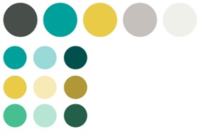
Example of a small colour palette:

Example of a large colour palette:

Example of a main colour palette and sub-brand colour palettes:
Happy or Sad
As mentioned earlier, colour is one of the easiest ways to communicate a message instantly and on an emotional level. One of the ways that colour does that is by making us feel a certain way. As Wassily Kandinsky, a pioneer of abstract art, said, “Colour is a power which directly influences the soul.”
Of course, colours have different connotations for different people and cultures (for example, in Hinduism white is the colour of mourning, while in the western world it is the colour brides wear on their wedding day). Colours have the power to evoke positive or negative emotions depending on the context. Determine the emotional impact you want your brand to have and use that as a starting point to develop your colour palette.
Example of a happy colour palette:

Example of a calm colour palette:

Example of an aggressive colour palette:

Example of a sombre colour palette:

High Contrast or Low Contrast
The level of contrast between colours can also affect how people perceive your brand. Having a dramatic, contrasting palette like black and white can be extremely impactful. However, this can be quite jarring and create eye strain after a while, so make sure to strike a balance with other complementary colours. A low contrast palette creates a consistent brand that’s easily recognizable. Going too far in either direction wouldn’t be ideal, so it’s always better to strike a balance.
Example of a high contrast colour palette:

Example of a low contrast colour palette:

A Trained Graphic Designer Can Help
There are millions of colours to choose from and each of them has its own unique set of pros and cons. Choosing the right shade of a colour can seem like a daunting task for someone who might never have thought about colour theory before. While this is a general guide to brand colours, a designer’s trained eye will be a great asset to any law firm that is looking to create a brand.
When you’re ready to create your new brand or rebrand your law firm, and you feel you need a little help, check out our branding services.
Sign Up To Our NewsletterRelated Insights
See All Insights