Many fonts and the way they are displayed can be difficult for users to read. Creating a website that is accessible allows all visitors to navigate sites easily and...
April 22, 2024
Insight
Designing Impactful Online Presentations: Tips For Lawyers
June 25, 2021
Lately, we find ourselves giving more presentations than ever before. For over a year the online presentation has been a staple for general meetings, seminars, and client presentations.
While many lawyers and law firms have adapted to this new way of communicating, some of us need a little guidance to get on the right track.
Here are 5 tips for putting together a phenomenal presentation, whether you are using tried and true PowerPoint, Google Slides, or Prezi.
1. Consistency is Key
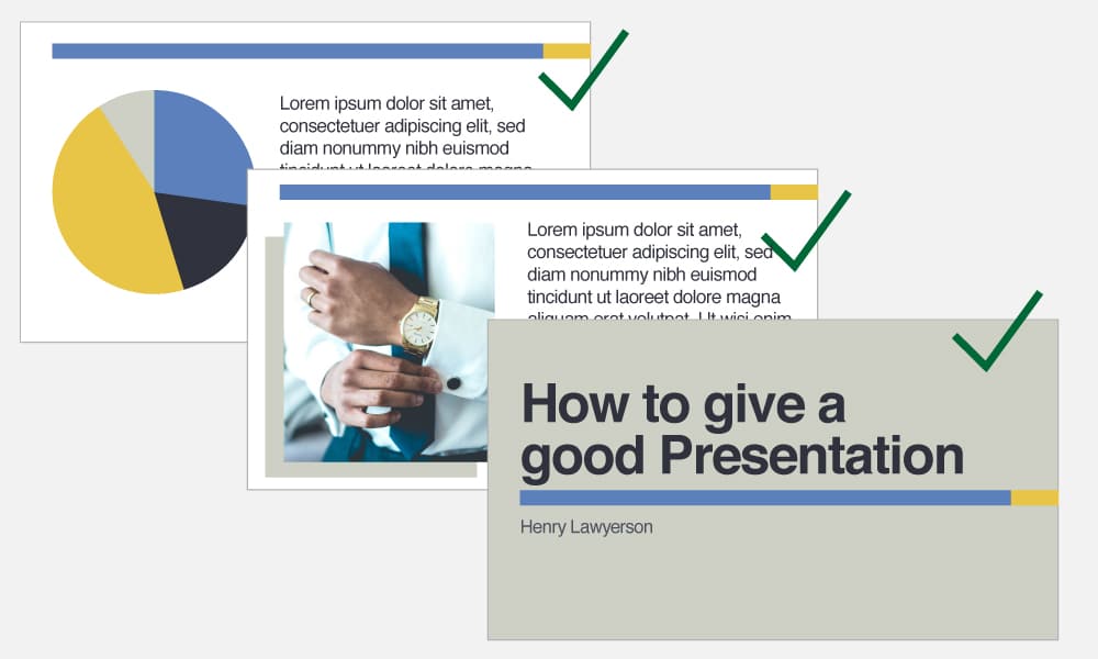
Keep all of your fonts, colours and graphics consistent throughout your presentation. There is nothing more jarring than a presentation that is a higgledy-piggledy tangle of fonts and colours. Not to mention having a confusing mix of watermarked photographs, old pixelated comics, grainy scans, and ancient clip art. Pick a style and stick to it. On every slide. No exceptions.
A clean, consistent presentation makes everyone feel at ease and comfortable, building trust in you and what you have to say. Your audience can’t concentrate on what you’re trying to say if they’re distracted by your presentation slides. Having a firmwide template is the easiest way to achieve consistency. Once all the hard work has been done with putting together the master template, all you have to do is adhere to that template for every presentation.
2. A Picture is Worth a Thousand Words

Once you’ve chosen an image style, you need to actually pick images to go with your slide content. What images you choose and the style of images all depends on your brand, what your presentation is about, and the audience. But here are some points to keep in mind when choosing images.
Make sure your images:
- are good quality and clear. Use a stock photo site for best results.
- don’t have watermarks. Purchase the licence to use the image to remove the watermarks or choose a different image.
- aren’t pixelated. Sometimes when an image is copy-pasted rather than inserted it loses quality.
- are consistent with your law firm brand. Refer to your firm’s brand guide to make sure your images conform to the brand. Ask your marketing team if you’re in doubt.
- don’t have stereotypical law elements like blindfolded Lady Justice, scales, gavels, etc.
3. Balance, Baby
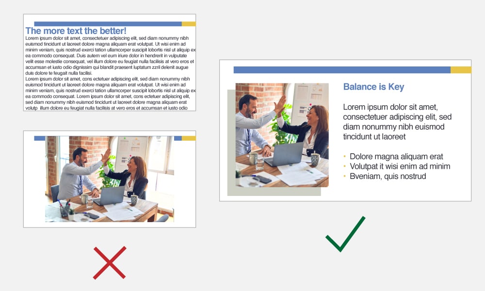
We all know that text overload in a presentation is not great, but a presentation with only images is just as likely to cause your audience’s eyes to glaze over.
Striking a balance between clear, interesting images and concise, readable text is what you need to strive for. Balanced slides also appeal to all audiences. Some people like to read ahead, others like to analyze pictures while the presenter is speaking. Make sure both groups have something to occupy them while viewing your presentation.
4. Keep Them on Their Toes
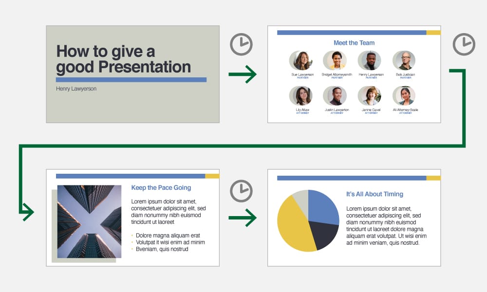
Speaking of boring your audience to tears, the easiest way to achieve this is by making them stare at the same slide for 40 minutes. Keep your audience engaged by changing up what they’re looking at. Take advantage of the animation feature in PowerPoint or Google Slides to guide your audience through your points.
Of course, balance is key, so don’t go too far in the other direction and change slides every 2 seconds.
5. Avoid Information Overload
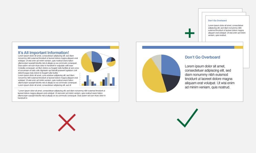
We know it’s tempting to throw everything and the kitchen sink at your audience, to back up all your points with stacks of research and explain every aspect of a complicated and nuanced issue. But this is not a brief or dissertation: it’s a presentation.
And the purpose of a presentation is to be an informative overview, not a deep dive.
If you feel like extra information is necessary, then you can always provide a link to supporting documents or further reading.
Bonus Tip: Don’t make it Red
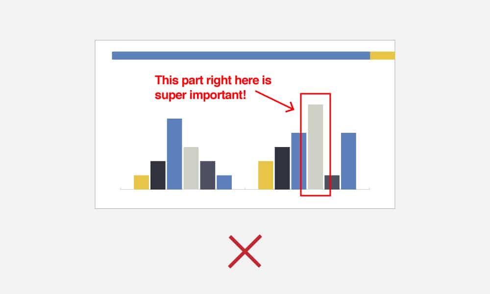
“This part is really important, I want it to stand out. Let’s make the text bold and red!” Sound familiar?
Unless you’re giving a safety presentation to a group of preschoolers, don’t do this. There are many ways to make the important parts of a presentation stand out that are much more brand consistent and effective. For example: if you want a certain point to stand out the most from the whole presentation, dedicate an entire separate slide to that point.
If you are looking to step up your online presentation game, following these few simple guidelines will take you to the next level. The easiest way to design a brilliant presentation is to leverage a solid template rooted in a distinct law firm brand. If you don’t have a master template, creating one should be a priority for your firm.
Check out our branding and graphic design services to learn how we can help you.
Sign Up To Our NewsletterRelated Insights
See All Insights