Reynolds Mirth
Creating an exemplary brand and website for an exemplary firm
The firm
Reynolds Mirth is an Edmonton-based law firm that has provided outstanding legal advice to businesses, public bodies, and individuals since 1915. With more than a century of service, Reynolds Mirth has an unrivalled depth of expertise in their areas of practice and confidently competes at the same level as national and global firms. Their lawyers are leaders advancing the legal profession.
The challenge
Reynolds Mirth’s previous brand and website didn’t do justice to the firm’s dynamic and engaging qualities. The logo felt uninspired with a cold blue colour and block lettering, and the legal name as part of the logo was unnecessarily busy. The website’s look and layout were dated. The same blue that appeared in the logo also appeared throughout the website, creating a formal impression that didn’t convey the energy of the firm or the intelligence of its lawyers. This certainly didn’t allow Reynolds Mirth to stand out from their competitors. Enter fSquared Marketing.
The work
“It was essential for our new branding and website to feel modern while reflecting and celebrating the firm’s storied history. From the very beginning, it was clear that fSquared Marketing understood this implicitly. It was also apparent that fSquared Marketing knows law firms; to have immediate shorthand with our agency was invaluable. The depth of their expertise eased the entire process, from logo options to design choices to the flow of the website. We couldn’t be more pleased with the result.”
Christine R. Dewitt, Director of Client Relations
Branding / Identity
Discovery & Verbal Brand
Through a series of discovery sessions, we established Reynold Mirth’s brand identity by unearthing the firm’s key messaging. Reynolds Mirth is known for their long-standing client relationships, their intelligent approach to the law, their high quality of work, and their culture of mutual respect and collaboration. Reynolds Mirth has operated for over a hundred years and its lawyers and legal support staff are passionate members of the Edmonton community. It was important to us that their brand spirit of a storied history, a tradition of excellence, and a focused and responsive approach to their clients and the law stand out in their messaging.
Designing the Visual Brand
Our creative and results-focused design team set about creating the brand’s visual elements.
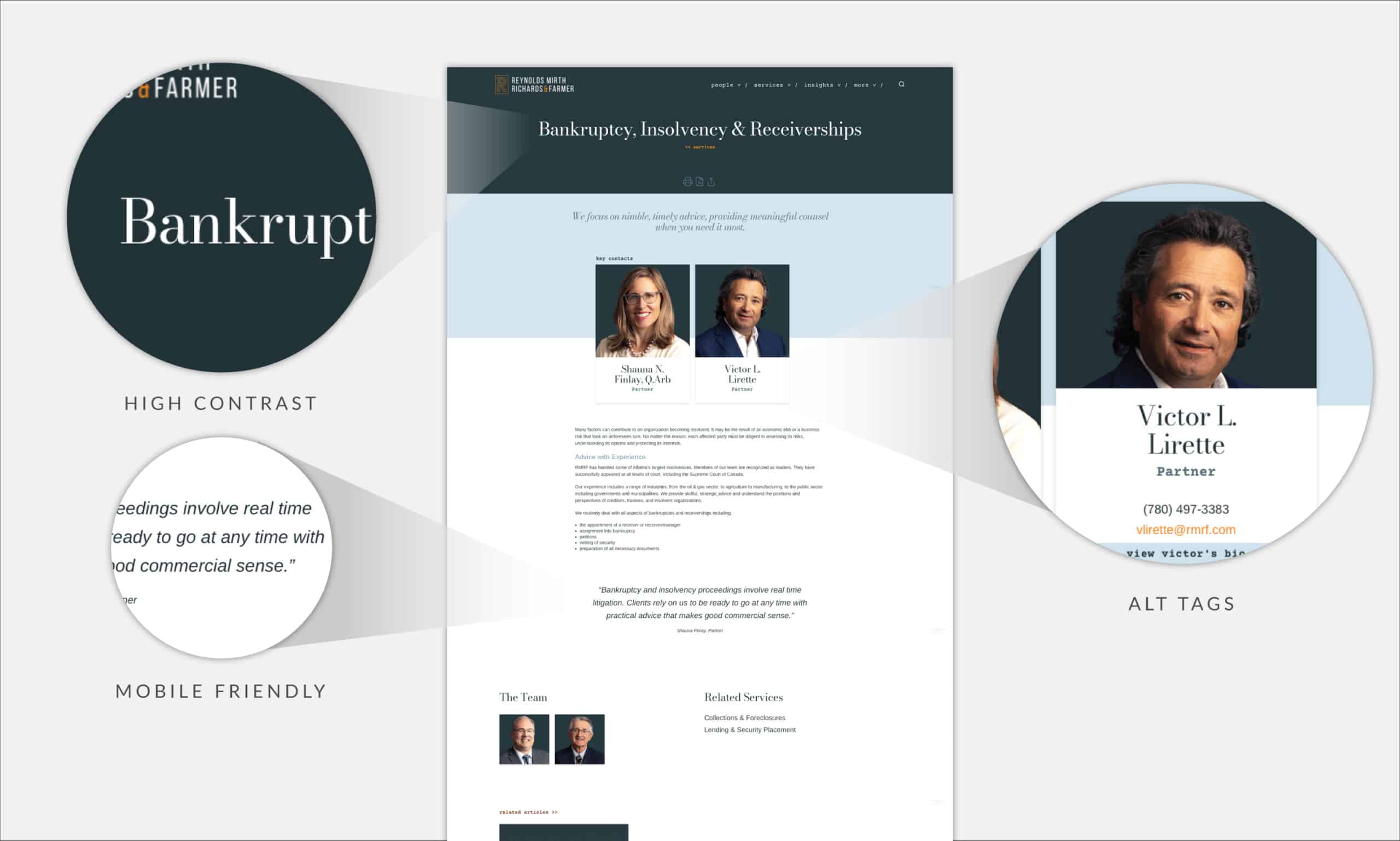
Designing a new logo was of the upmost importance. We decided to focus on the first letter of the firm’s name, the “R,” and created an art-deco-style logo calling to mind the last century with a dynamic twist: the stem of the R stepping behind the tail to evoke a sense of action. This also gave the marketing team a design element they can incorporate into future branded materials.
Next, the colour palette, essential to standing out in a crowded market and crucial to conveying a company’s character. Although blue may be the world’s favourite colour, we went a different direction with it, settling on a very dark shade of blue we call vintage navy to impart the firm’s depth of experience and client trust. To complement the dark blue, we chose a golden orange, similar to marigold, calling to mind the warmth and energy of the team at Reynold’s Mirth. Soft neutrals and a pale blue make up the firm’s secondary colours. Lastly, the fonts—we chose a Bodoni font as the main typography for its stylish history and contemporary appeal.
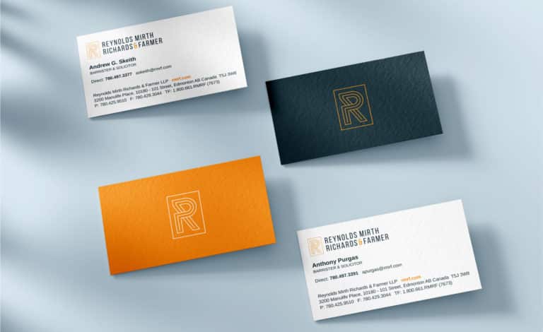
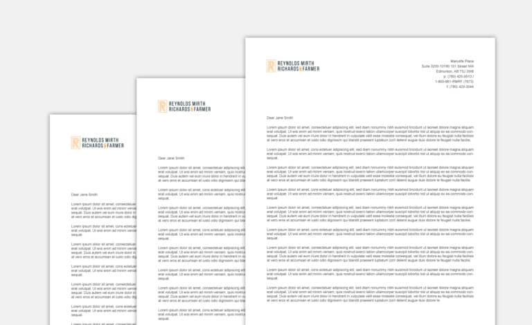
Communications Tools & Collateral
The system of visual elements that comprise the brand, the logo, colour palette, and typography, conveys and reinforces the Reynolds Mirth brand in all the firm’s communications. We developed communication and marketing collateral with the striking colour combination of the vintage navy and marigold for their stationery, business cards, letterhead, e-signatures, and social media header graphics. A robust brand style guide was produced for the firm to ensure consistency of use in the future.

Web Design & Development
Scope & Pre-production
One of the advantages of working with fSquared Marketing is that we know lawyers and law firms. Our expertise in designing sites specifically for law firms allows us to meet our clients where they are and quickly understand where they want to go. Working with the team at Reynolds Mirth, we easily grasped the firm’s goals, their audience, and the mindset of their clients to create a website design that allowed lawyers and visitors to find and do what they needed with ease and speed. Our design team created Information Architecture and Interface Design Wireframes focused on a seamless user experience.
Website Design & Planning
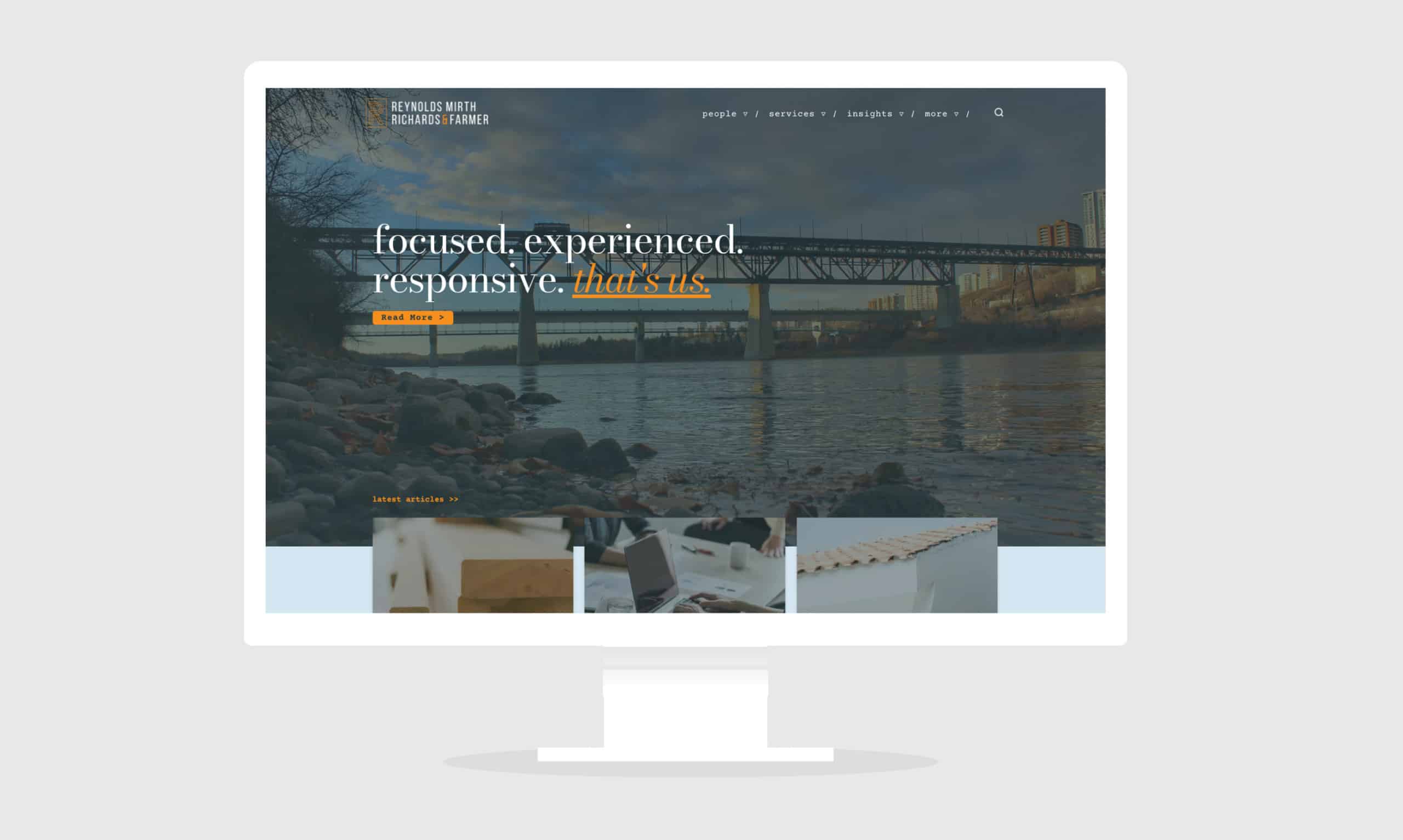
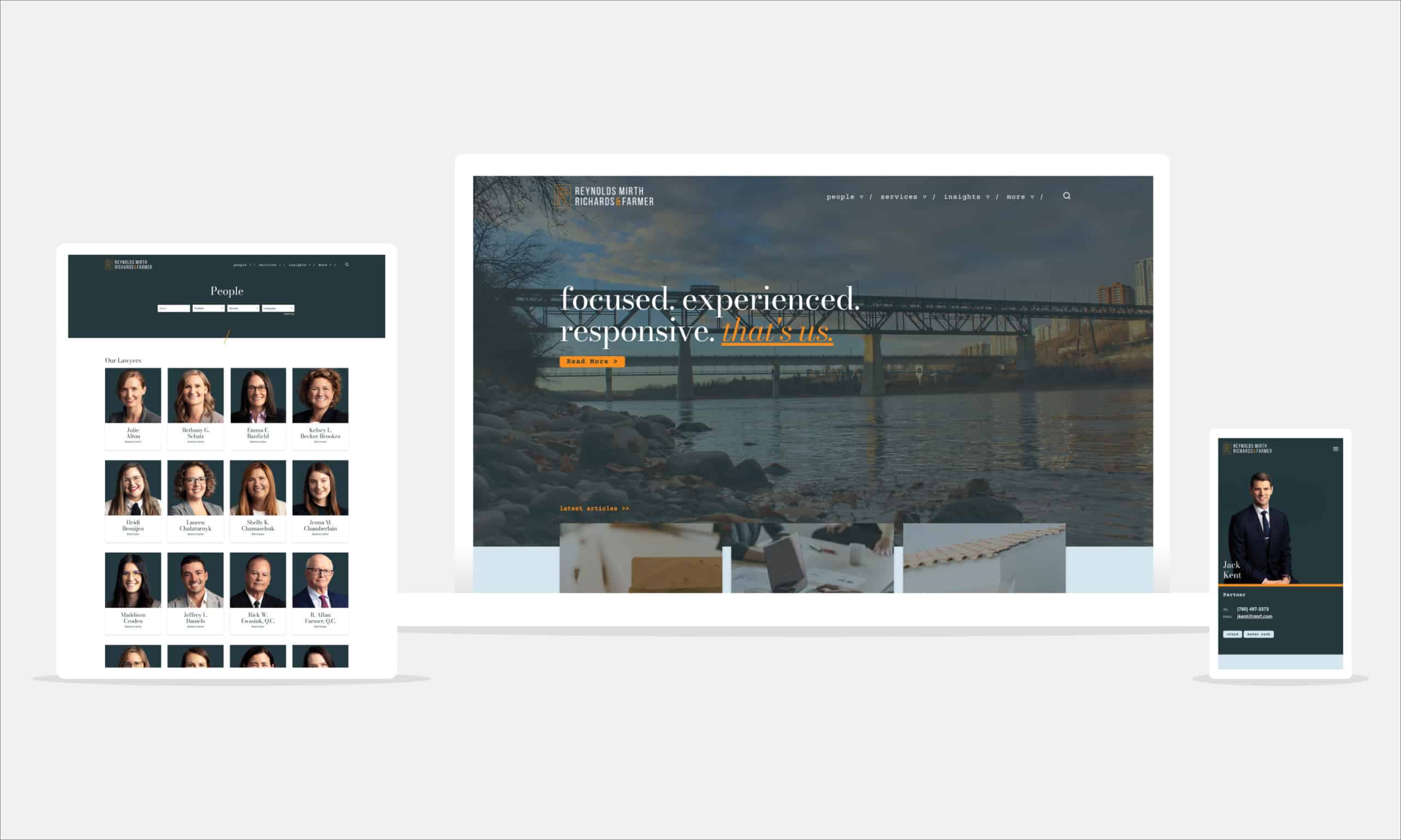
Creating a visual interface that is simple to use and showcases the firm’s brand sees visitors greeted with Reynold Mirth’s key messages of focus, experience, and responsiveness above a subtle image of the North Saskatchewan River. Links lead to more information on the firm as well as latest articles, representing the lawyers’ ongoing contributions to the legal industry. Scrolling down, visitors are taken to an our services link followed by an events module, a new feature of the site where key upcoming events for the firm are found, and last but not least, firm news. The various sections are colour blocked in the secondary colour scheme with links and information featured in the vintage navy and marigold.
Custom Code & Site Build
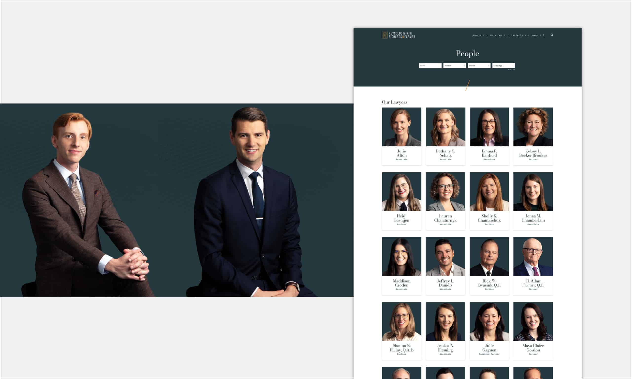
Our aim with Reynolds Mirth was to design a website that was as focused and responsive as the firm. The site is uncomplicated and effortless with clear navigation. We achieved this by showcasing the essentials and giving users a clear route through the site from the moment they start scrolling. We utilized what we call “Intelligent Content Linking” so that related pages, content, and people are connected in a way that feels intuitive. From the people tab, not only can you view the different hierarchies of the team or search for a particular person, but you can quickly view lawyers’ latest articles or learn more about careers at Reynolds Mirth. It’s easy to move back and forth between the lawyers connected with the firm’s services and more information on that service, as well as related practice areas.
Accessibility
We’re known for our expertise in accessibility and ensure our clients’ websites comply with web accessibility laws and policies. We applied our knowledge of accessibility best practices to Reynolds Mirth’s new website, reaching WCAG 2.1 Level ‘AA’ through our design and development techniques and accessibility testing.
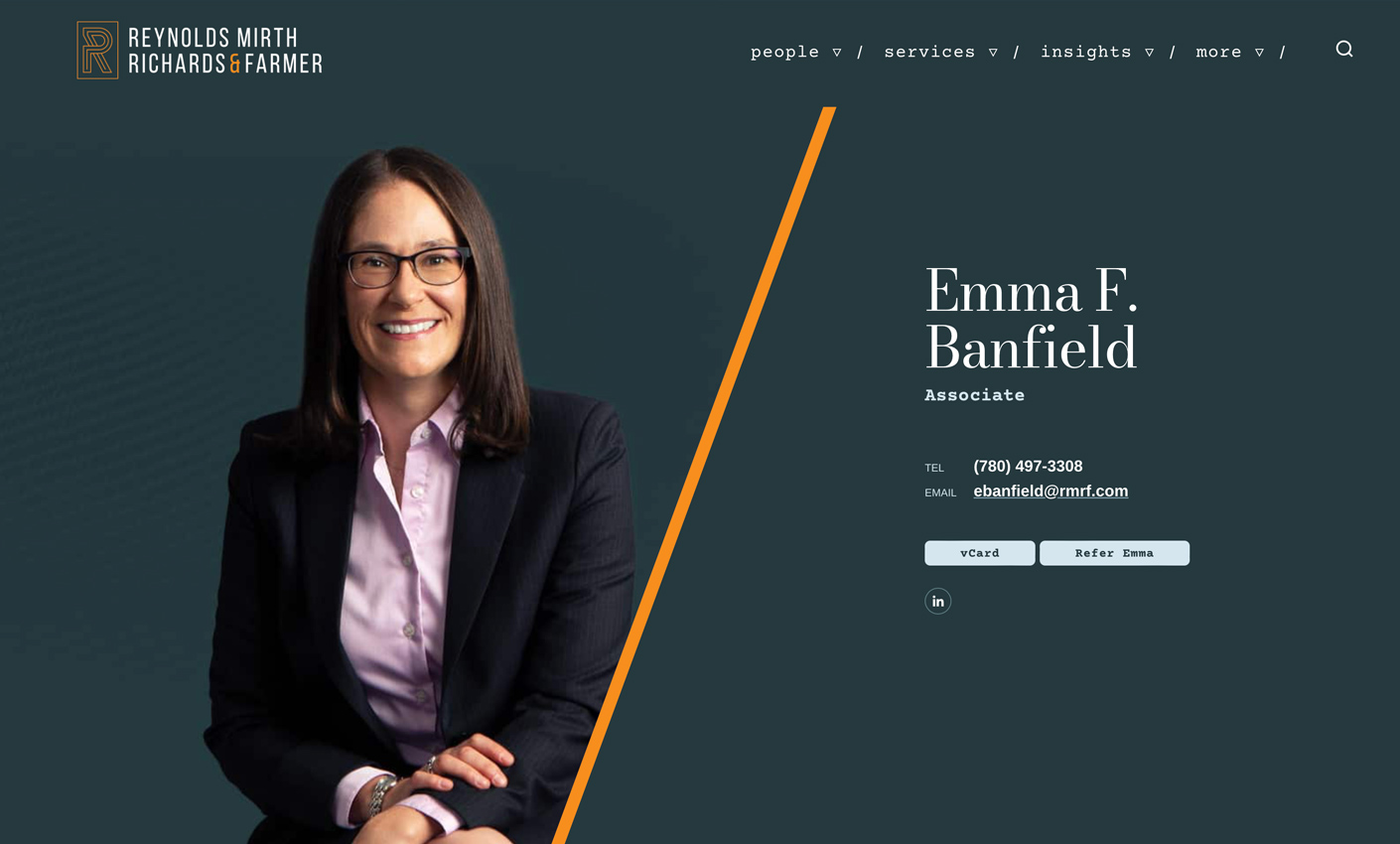
Lawyer Photography
Photos are a key part of the Reynolds Mirth visual identity—these lawyer portraits definitely capture the friendly personalities of the firm’s lawyers and legal support staff. Our curated photography services included art direction, dress-code guidelines, and photo editing. These photos were treated to achieve a warm, neutral tone.
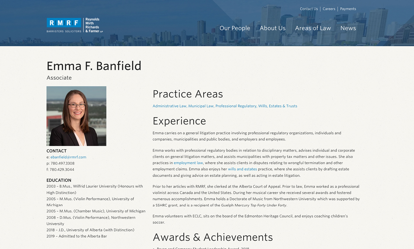
Lawyer Bios
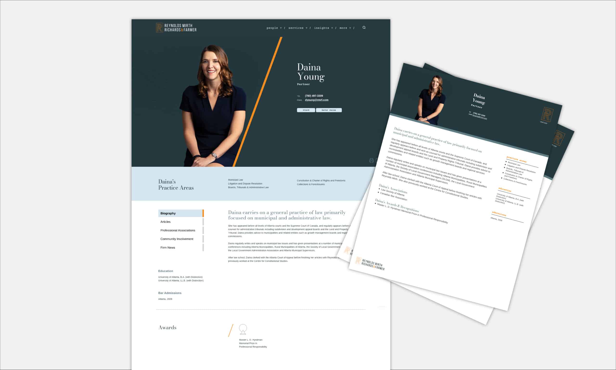
We designed these lawyer bios so that key information is visible the moment a visitor lands on the page. Visitors can contact staff directly by hovering over their photos. Additionally, a print to PDF function is readily available at the top of each staff member’s page.
Responsive Design
The new rmrf.com is mobile responsive, meaning the site has been designed to accommodate modern screen resolutions and all major browsers. The website can be easily accessed on desktop, tablet, or smartphone. The new rmrf.com will look great on any device.
Value Added Services
Search Engine Optimization (SEO)
Our web marketing team implemented SEO best practices and tactics throughout the new website to improve performance on Google and other major search engines. To help rmrf.com get found online, we optimized content and provided all-around strategic advice.
Project Management
We are known for our stellar project management. fSquared Marketing’s extensive experience in legal marketing and website development along with our proprietary project management and communication tools ensured we kept Reynolds Mirth on target toward a successful launch.