North Shore Law
Creating a comprehensive brand experience
The firm
In operation for nearly fifty years, North Shore Law has long been a trusted resource for businesses, families, and individuals in North Vancouver and across Metro Vancouver. This firm offers comprehensive legal services across a range of personal and business matters.
The challenge
North Shore Law isn’t the same firm as it was in the ‘70s. The firm’s commitment to clients has remained the same, but the firm has grown to serve a greater range of people and businesses. The existing brand didn’t reflect the firm’s present or its future, and the website was too slow and cumbersome for modern users. It was time for something new, so they called our team.
The work
- Branding
- Website Design & Development
- Creative Direction & Lawyer Photography
- Communication Tools & Collateral
- Graphic design
- Content Writing
- Social Media
- Search Engine Optimization (SEO)
- Project Management
The Branding
Finding the firm’s voice
Great brands are self-assured, they know who they are and what they are here to do. Through Discovery Sessions, we got to know the lawyers and staff of North Shore Law. We learned about the firm’s indelible connection to the wider community, about their commitment to responsive service, and how they go the extra mile for clients. We helped to articulate these themes into a set of key messages, a fundamental step in establishing a strong brand identity.
Designing the firm’s brand
Based on our conversations in Discovery, we’d learned what North Shore Law brings to the table. Now it was up to our design team to create a consistent, authentic brand aesthetic. Through a highly collaborative process, our designers helped North Shore Law look like the firm we knew it to be.
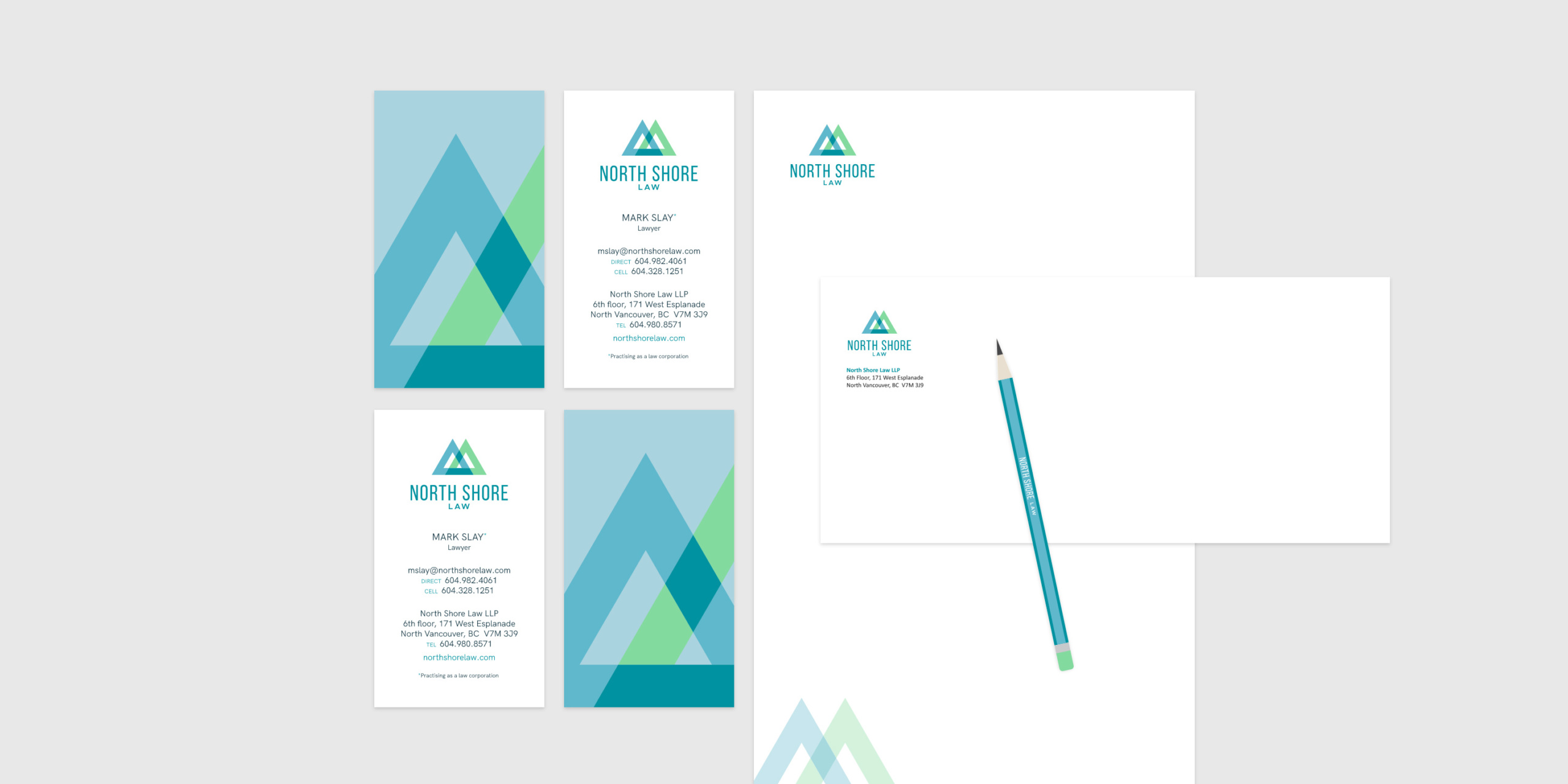
The firm’s new logo draws inspiration from the Coast Mountains and the colours of nature. The triangular shape is a nod to the cardinal north of a compass, while the interlocking elements reflect the interconnectedness of business and personal matters, and the firm’s ability to provide services in both areas. The intersecting triangles also represent the team-based atmosphere within the firm and North Shore Law’s abiding connection to the community.
The firm’s new colour palette and photography style were likewise designed to reflect this connection to their environment. Our designers applied this visual aesthetic across all media and platforms, from digital to print.
Brand Execution
Photography
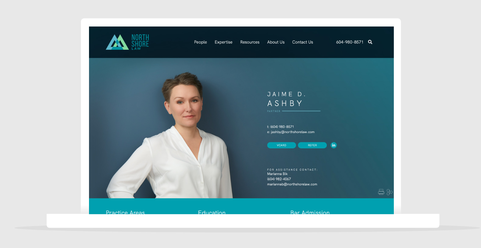
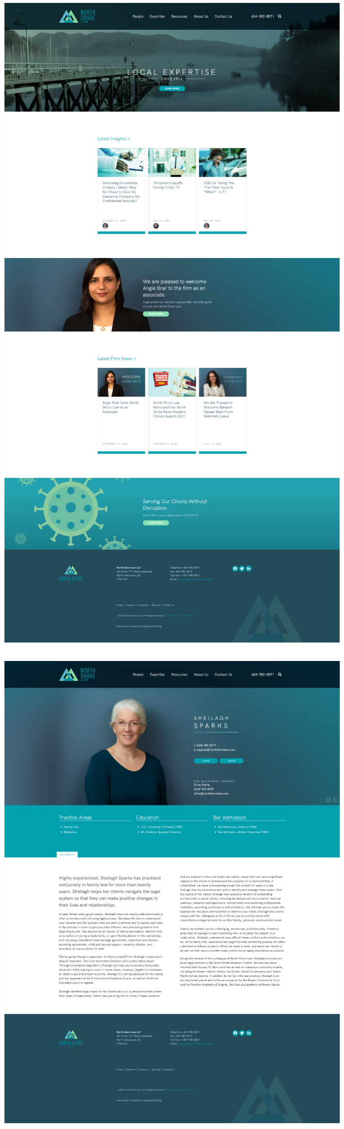
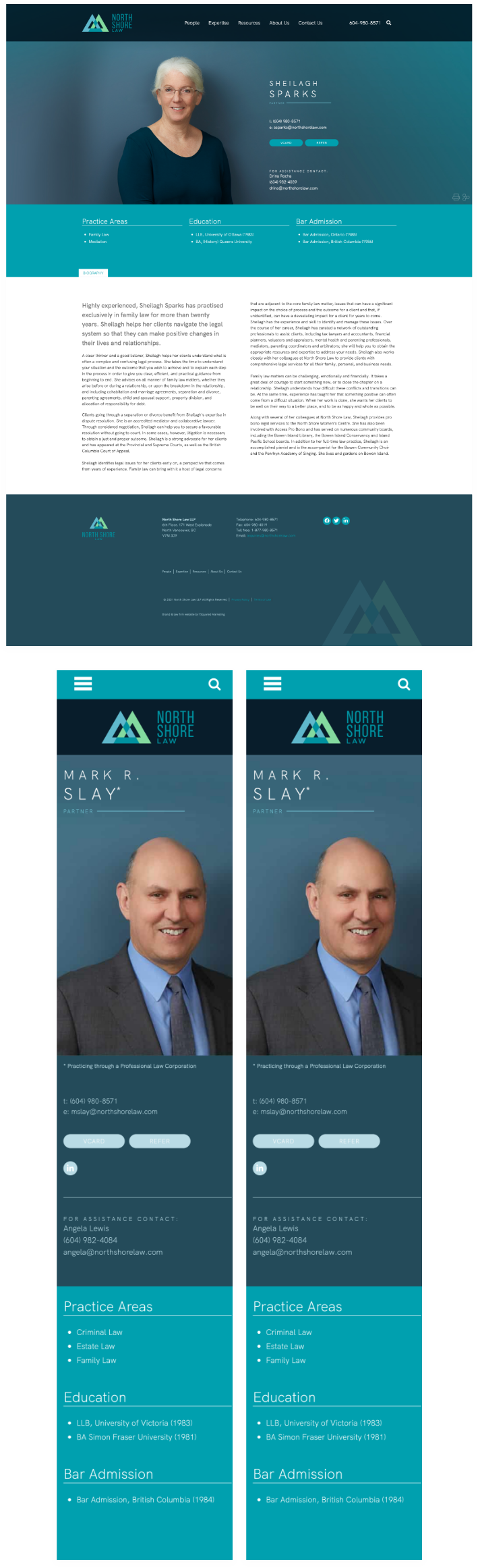
Impactful, authentic photography is a core part of differentiating a law firm. For these lawyer bios, we chose an aesthetic that is warm, direct, and approachable. We treated these portraits with brand colours and west coast inspired tones. This style is reflective of the firm’s overall visual brand.
Brand Standards
Every touchpoint a person has with a firm is part of the brand experience. It doesn’t matter if a prospect is putting a lawyer’s business card in their wallet or clicking on a social media post. Through the establishment of a robust Brand Guide with defined brand standards, we ensured that North Shore Law would look its best in person, in print, and on the Internet.
Stationery
Every communication that a firm has with its clients, its prospects, its staff, and the media, is a reflection of who that firm is and what it stands for. That might sound like hyperbole, but it’s the secret of effective brand building. We wanted to ensure that every time a lawyer at North Shore Law put pen to paper, the firm’s brand was expressed. To that end, we designed a comprehensive set of stationery for the firm, including business cards, letterhead, and envelopes.

Modern Website
We designed a website for North Shore Law that is fast, secure, and user-friendly. Special attention was paid to ensuring that northshorelaw.com serves the needs of all the firm’s audiences: business and personal.